After a back injury, unable to golf or walk any distance, I found myself in an art supply store in 2000. I was visiting Santa Barbara and couldn't do any of the things I normally loved to do. I picked up some oil pastels, and proceeded to paint a sad interpretation of my hotels beautiful courtyard. My best efforts couldn't release the image I had in my mind's eye. I was baffled, but excited.
Back in Rhode Island I found a drawing class at the Community Center where I lived in Jamestown. It was taught by a wonderful patient man, Jim Filkins, and that restarted my journey into the formal study of art, after a hiatus of many years. I told myself it wasn't too late.
From a sketchbook dated 2/06/01:
We worked in graphite and one of the exercises was this:
Set up a series of shapes, make some overlap and some transparent. Make it look like there are layers in the way you lay down the graphite.
We had learned to make a 1-9 value scale and now we were learning that darker values recede. Rendering those values could create an illusion and that would be an important skill to acquire when we did landscapes. We learned some basic principles of landscape too; higher contrast in the foreground denotes its' closeness to the viewer. A blurred and softened horizon indicates the distance.
For this exercise, it was not about perspective; but gaining experience with flat shapes and design.
Wednesday, September 26, 2018
Sunday, September 23, 2018
Less is More
I am going to try something new with this painting. It's a beginning, a cadmium red toned canvas with the lights painted in pale pink. I posted it on Instagram and one friend, a painter, said; "It's finished!" That gave me an idea. How can I add more paint, lots of layers of paint, but retain the image that I started with- which is a Notan? Notan is a Japanese word that means "light-dark balance,"and can be achieved by value masses of light and dark within a composition. Instead of five or even three values, we reduce the values to two. Light and dark. What could be more simple?
Labels:
24x24,
Anne Winthrop Cordin,
cityscape,
landscape,
notan,
oil painting
Wednesday, September 19, 2018
Art School Notebook 2
Contrast of extension, where 2 colors appear to be the same color. An exercise in learning to see what color does when it is placed next to other colors. Spring semester 2004, at Lyme Academy of Fine Arts.
A little plein air study in gouache painted on a sunny day in July 2003.
Labels:
Anne Winthrop Cordin,
gouache,
homework,
plein air
Sunday, September 16, 2018
Plein Air to Studio
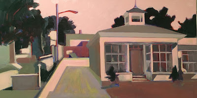
A street in Newport that I drive by all the time. The storefronts are very attractive, but I'm attracted to the light in the alley as well as the shadows on the back wall.
Here's the block in. It took a while, as I wanted to get the focal point in the right position . The canvas was toned with cadmium red light which served as my middle ground. I added the darks, then the lights.
I saw that the pink was overpowering, also that the building on the right had too much emphasis. I balanced it by adding a lot of neutrals to the right side and also finding more middle values on the left side. I want my viewer to go down that alley!
I'm not sure this is done, so I will let it sit for a while. I've already started a larger painting based on the left side of this one. I will show you more in my next post.
Here's the block in. It took a while, as I wanted to get the focal point in the right position . The canvas was toned with cadmium red light which served as my middle ground. I added the darks, then the lights.
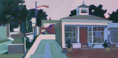
Back in the studio, I went bold with yellow for the light. I began to add a pink sky, by then it was time to call it a night.
I wasn't in love with the yellow, so I changed it all to pink. I know I could have played with color in Photoshop, but I liked the layering aspect of working a little slower and having time to look and get my gut reaction before taking the next step.
I saw that the pink was overpowering, also that the building on the right had too much emphasis. I balanced it by adding a lot of neutrals to the right side and also finding more middle values on the left side. I want my viewer to go down that alley!
I'm not sure this is done, so I will let it sit for a while. I've already started a larger painting based on the left side of this one. I will show you more in my next post.
Labels:
12x24,
Anne Winthrop Cordin,
city street,
landscape,
oil painting,
plein air,
studio
Wednesday, September 12, 2018
Art School Notebook 1
Thought I would share some pearls from the notebooks when I was formally studying art.
All the color swatches were paper painted with gouache first and then cut into squares for the exercises.
The page heading was the 7 color contrasts: Value, Hue, Intensity, Temperature, Simultaneous contrast, Extension, and Complementary.
The exercise shown here is one color appearing to be two different colors and is based on the work of Josef Albers and his book Interaction of Color. The main teaching is that the identity depends on its situation, the amount, placement and shape of the color. The color sandwiched between the yellow appears so much darker. If you have trouble seeing that, squint!
Notebook: 3/05/04
All the color swatches were paper painted with gouache first and then cut into squares for the exercises.
The page heading was the 7 color contrasts: Value, Hue, Intensity, Temperature, Simultaneous contrast, Extension, and Complementary.
Notebook: 3/05/04
This study in gouache was done plein air in St Augustine, FL. 2003
Labels:
Anne Winthrop Cordin,
gouache,
homework,
plein air
Friday, September 7, 2018
Art League of RI Exhibition
Here are the two paintings I'll be showing at the 18th Annual Elected Artists of the Art League of Rhode Island exhibition. I'm very honored to be in such great company- check out the website and you'll see what I mean. The exhibition will be at the Jamestown Arts Center, a town I lived in for eighteen years. The opening reception will be Thursday, September 20th from 6-8pm. Exhibition: September 20- October 20, 2018
Titled Boats & Dinghies, this oil painting is 16x20, and gave me a
chance to explore the range of neutral grays offset by clear color. Chroma is intensified when it's next to a neutral.
Titled Working Boats, I wanted to focus more on shape and color than on any specific boats or part of a boat. Tied up at the dock, when the tide was low, I was drawn by the shapes made by the pilings, and the hulls of the background boats. Also 16x20, oil.
Both of these are studio paintings, with multiple layers of paint, which is a departure from my usual "paint it all in one session" approach. This let me slow down and experience the process in a way I find very satisfying.
Subscribe to:
Posts (Atom)


