Showing posts with label Still Life. Show all posts

Saturday, November 19, 2022

One Looks to the West

One Looks to the West is the second of three small oil paintings of daisies. Cradled wood panel ready to hang or sit on a mantle/shelf to cheer your home. A sweet gift. 


Thursday, November 17, 2022

One Looks to the East

 Here’s the first of three small daisy paintings. Painted from direct observation- 6x6 cradled wood panel, wired for hanging or sitting on a mantle/ shelf. Perfect for holiday giving. The title One Looks to the East refers to the hope that each new day brings.


Monday, February 21, 2022

L’Heure Bleu (The Blue Hour)


 The time of day when the sky turns this magnificent color is called “l’heure bleu” by the French. It was my mother’s favorite time of day and although she’s been gone for 15 years, I still think of her when the sky is this color. 

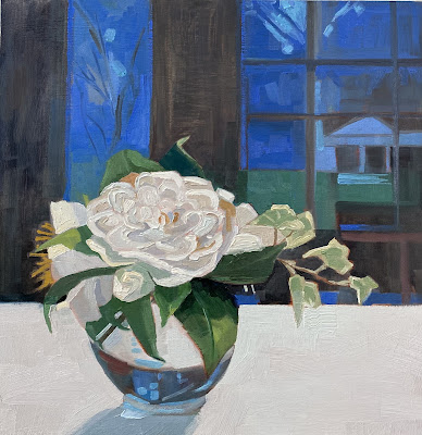
I painted this from a dear friends post on IG- something that I never do, which is to paint from a photo source not my own. Never say never! The exquisite camellia came from her garden;  she ended up falling in love and buying it before the paint was dry. 

I love it when everyone’s happy.

Sunday, February 6, 2022

It’s All in Here


 Back in the day- I carried a big bag. When I switched to something smaller- mainly for the sake of my shoulders- I wanted to capture this bag hanging over the back of the kitchen barstool. I love the rich oranges, creams, and browns of this palette! Update!!! Sold!!! A big thank you!!!

Saturday, August 25, 2018

Mystic Museum of Art

So thrilled that my painting Summer Table was accepted into the 62nd Regional Exhibition at The Mystic Museum of Art. This painting is 16x20 and was painted from direct observation, objects set up on my dining room table. Honored to be hung among such great company, in a beautiful setting, in downtown Mystic, CT. The exhibit will run through Sept 22, 2018, so there's still time to see it. 

Friday, August 10, 2018

My friends know I love flowers


The first time my friend Susan came to dinner she brought me a bunch of sunflowers, which of course I later painted. Last week she came over, again for dinner, and again with flowers, with a token sunflower in remembrance of that first dinner. 
She's thoughtful like that, and that's a quality I hope for myself with my friends. Remembering what they like. How they take their coffee. What's been going on in their lives. I'm feeling very grateful  for the close connection I feel with the women and men in my life today.
The next day I took the flowers out back, where I found a spot of shade, and found myself obsessed with the Queen Anne's Lace. Considered nothing more than a weed by many, I marveled at its' structure and divine color. This is oil on panel, 11x14.

Wednesday, April 11, 2018

Blue Stripes & Vase


A modernist approach to an interior in this limited palette oil painting. I flattened the shapes so that the outside landscape doesn't recede. This is the view from the sliders to the courtyard and I really simplified the shapes to further flatten the space. Look for where I used lost edges! Those are exciting areas for me!
If I were painting plein air and wanted to show atmospheric perspective I would use different techniques.

Saturday, September 16, 2017

Grace is a DPW FB pick of the day


My 5x7 painting achieves several of the things I hope will happen when I spy a potential painting.
First, the light was lovely, even though the sun was hot; I positioned my panel so that it would be in the shade. This makes it easier for me to see the value shifts.
Second, it had the great complementary combination of blue and orange, with the orange playing a bit part. It's more about the fabulous color of the purple cone flower for me. 
Third, I had opportunities to simplify with both the vase and the tablecloth. Even though I can appreciate the detail in both, it's more me to "keep it simple". 
Simple, strong shapes and color are what worked to make it a Daily Paintworks FB pick of the day. 


This was painted plein air in the garden, but here's a reference photo so you can see what has been left out.

Wednesday, December 21, 2016

Take Two


Another look at the dried pods and flowers that is part of the large collection of things to paint at the studio. There is never a shortage of items to inspire, but I decided to have a go at the same items but paint it in a different way. I did, however, keep the shadow a large element in my composition, this time cropping the pods quite sharply at the top of the painting. The yellow horizontal band made its' way in to break up the shadow with a structured shape to contrast against the many organic shapes.

Saturday, December 17, 2016

Dried Pods


Studio still life has many of the elements within my control- what I choose to paint, how it will be lit, the composition of the elements. In this painting I chose to emphasize the shadow as an integral part of the composition. 8x10 on linen. I'm fascinated with rendering the pods with minimum detail while letting the viewer know exactly what they're looking at.


Saturday, November 19, 2016

Surface Tension

 Just thrilled that my painting titled Scattered Light made it to Surface Tension, an exhibition collaborating works between URI faculty and students as well as members of the Art League of Rhode Island. Held at URI's Main Campus Gallery, the show was on exhibit October11-November 18, 2016. I love forsythia, among the first to bloom in our gardens here in the Northeast, an explosion of the happiest of colors-yellow! This oil painting is 12x24.

Thursday, October 20, 2016

Switching Gears

Getting reading to go on the road for a few weeks and thinking about how I want to work. Fooled around with the tiny artist tiles- only a 4x4 surface- very portable to be sure. Gouache is also easily portable, quick to set up for painting and I love the way you can layer so easily in the same session. 


Saturday, March 29, 2014

Pink Hyacinth

Working on a 16x20 canvas, spring bulbs with paper wrapping. I am interested in the folds of the paper, red on one side and pink on the other. I want to give the impression of the flower without showing each and every petal.


Wednesday, March 12, 2014

Studio Input

I was painting merrily along yesterday and asked for (be careful what you ask for) some input from my studio colleagues and here's what I heard
1. It's looking like 2 different paintings, the chair on the right and the flowers on the left.
2. The upper right corner is too heavy and the bottom right corner pulls you out.
Now first, let me say, I asked for feedback. With it I have choices. Leave it my way or take suggestions. In the end, I just want a good painting! Note: they gave me all positive feedback first! I love being in a studio with such caring, talented, and generous artists who want and help me be a better painter!


Monday, March 10, 2014

Beginning of Yellow Tulips

I'm painting over an old painting, so first I sand the surface of the canvas, wipe off, then rub over it with a rag saturated with linseed oil/mineral spirit mix. I painted my initial layout using thinned down ultramarine and a #6 bristle round brush. This is the only time I really ever use a round brush! Mixing the values I want and not worrying too much about getting the exact color, I lay down paint in big shapes. Ok, that's all the time I have today!
16x20 oil on canvas

Wednesday, February 5, 2014

In the Studio

The class I teach at Beach Studios has started up again and I thought I'd share my paintings from those classes. I don't manage to get them finished during class but they do serve as reference as to:
1. Determining a composition from a setup. I highly suggest small thumbnails to see how the painting will fit in the picture plane. This saves valuable time later when you discover the orientation is wrong, should have been vertical and not horizontal  or worse, the center of interest has managed to not even be on the canvas.
2. I demonstrate color mixing and how to see relative value.


I have gone back into this painting and made several changes which I think improve it:
1. Changing the background to a more neutral warm grey.
2. Changing the right hand shape and the color around it to echo some of what is happening in the plate. 
3. Increased the value around the lemon and on the plate to emphasize those shapes. 
Sometimes a painting has to sit a bit before I can "see" it and make changes. What do you think?

Wednesday, July 18, 2012

Red White And Blue ll

Another red,white and blue painting. This just says summer to me. 8x8 Gallery Edge canvas.

Tuesday, July 17, 2012

Red White and Blue 1

Have been thinking about a red, white and blue series, inspired more by the color combination than a sense of patriotism, but heh, it IS July! This was done on an 8x8 Gallery Edge canvas, natural light at the dining room table, too hot to even make the trip to the studio!Continuing my study of striped fabric which I find intriguing.

Sunday, October 30, 2011

Lunaria annua 1

I know this as the money plant, but in the US it is know more commonly as Silver Dollars. I love the silvery dried seed pods and had to paint them, mixing the colors as accurately as I could. Some distortion happens on the computer... which is too bad. This is post 200, very exciting to me.

Wednesday, October 26, 2011

Red Grapes

Another study done with the palette knife. I'm going to hang them horizontally and you will see the table top and unity between the last 3 paintings. What's next? Planning a big studio painting of the harbour scene.